Contour Display
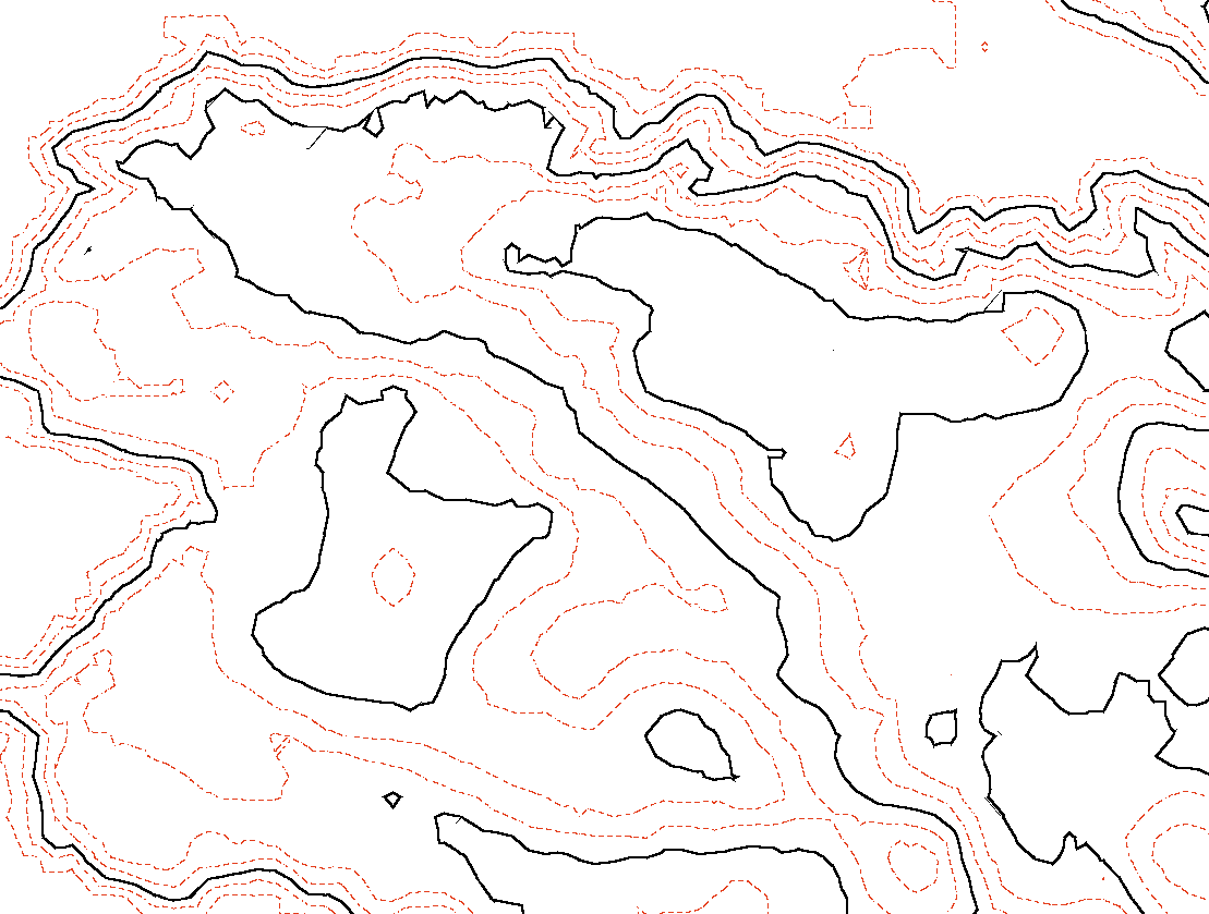
Contour display allows a user to apply specific contour line renderings to subcategories within a scene.
iTwin.js provides the following API to use this feature:
- DisplayStyle3dSettings now has a
contoursproperty which contains all of the subcategories-to-styling association data necessary to enable this feature. That object is of type ContourDisplay. - ContourDisplay defines how contours are displayed in the iModel based on a list of ContourGroup objects in the
groupsproperty. Whether or not contours will be displayed in the viewport is controlled by this object'sdisplayContoursproperty, which defaults to false. - ContourGroup describes an association of subcategories to contour styling. It contains a set of subcategory IDs titled
subCategories. Those subcategories will have the contour styling within the same group's ContourcontourDefobject applied to them. - Contour describes the rendering settings that apply to a specific set of subcategories within a ContourGroup. This actually describes stylings for two sets of contours: major and minor. These stylings are separate from each other. The minor contour occurs at a defined interval in meters. These intervals draw at a fixed height; they are not dependent on the range of the geometry to which they are applied. The major contour is dependent on the minor contour. The interval of its occurence is not measured directly in meters; rather its occurence is determined by the major interval count thusly: every nth contour will be styled as a major contour where n = the major interval count. For example, if you set this number to 1, every contour will be styled as a major contour. When it is 2, every other contour will be styled as a major contour, and so on. The properties describing how major and minor contours are styled are listed here:
majorStyleis the style that a major contour line will use. Defaults to an instantation of ContourStyle usingpixelWidthof 2 and default values for the other properties.minorStyleis the style that a minor contour line will use. Defaults to an instantation of ContourStyle using default values for the properties.minorIntervalis the interval for the minor contour occurrence in meters; these can be specified as fractional. Defaults to 1. If a value <= 0 is specified, this will be treated as 1 meter.majorIntervalCountis the count of minor contour intervals that define a major interval (integer > 0). A value of 1 means no minor contours will be shown, only major contours. Defaults to 5. If a value < 1 is specified, this will be treated as 1. If a non-integer value is specified, it will be treated as if it were rounded to the nearest integer.showGeometry, if true, shows underlying geometry along with the associated contours. If false, only shows the contours, not the underlying geometry. Defaults to true.
- ContourStyle describes the style settings used by either a major or minor contour. It contains the following properties:
coloris a color used by the major or minor contour of type RgbColor. Defaults to black.pixelWidthis the width in pixels of a major or minor contour line, using range 1 to 8.5 in 0.5 increments. Defaults to 1.patternis the line pattern applied to a major or minor contour line of type LinePixels. Defaults to LinePixels.Solid.
Consult the following code for an example of enabling and configuring contour display in iTwin.js:
/** Configure and enable contour display on a viewport. */
export function setupContourDisplay(viewport: Viewport): boolean {
const isContourDisplaySupported = (vw: ViewState) => vw.is3d();
const view = viewport.view;
if (!isContourDisplaySupported(view))
return false; // Contour display settings are only valid for 3d views
// Create a ContourDisplay object with the desired contour settings
const contourDisplayProps: ContourDisplayProps = {
displayContours: true, // this flag must be set to true in order to see any contours in the view
groups: [ // the list of style groupings, each associated with a possible list of subcategories
{
contourDef: {
showGeometry: true, // when true, this means the contours AND the underlying geometry will render
majorStyle: {
color: RgbColor.fromColorDef(ColorDef.red),
pixelWidth: 3,
pattern: LinePixels.Solid,
},
minorStyle: {
color: RgbColor.fromColorDef(ColorDef.blue),
pixelWidth: 1,
pattern: LinePixels.Code3,
},
minorInterval: 2,
majorIntervalCount: 8,
},
subCategories: CompressedId64Set.sortAndCompress([ "0x5b", "0x5a" ]),
},
{
contourDef: {
showGeometry: false, // when false, this means only the contours will render (and not the underlying geometry)
majorStyle: {
color: RgbColor.fromColorDef(ColorDef.black),
pixelWidth: 4,
pattern: LinePixels.Code4,
},
minorStyle: {
color: RgbColor.fromColorDef(ColorDef.white),
pixelWidth: 2,
pattern: LinePixels.Solid,
},
minorInterval: 1,
majorIntervalCount: 7,
},
subCategories: CompressedId64Set.sortAndCompress([ "0x5c", "0x6a" ]),
},
],
};
// Create a ContourDisplay object using the props created above
const contourDisplay = ContourDisplay.fromJSON(contourDisplayProps);
// Change the contours object on the 3d display style state to contain the new object
view.getDisplayStyle3d().settings.contours = contourDisplay;
// Sync the viewport with the new view state
viewport.synchWithView();
return true;
}
Here is a sample screenshot of applying some contour display settings to a terrain iModel:

Last Updated: 11 June, 2025
Found something wrong, missing, or unclear on this page? Raise an issue in our repo.